The Glints Jobseeker app is a content-driven product aimed at boosting user engagement and delivering value beyond just job applications.
Glints struggled to attract and retain a diverse user base such as mid-level professionals and recruiters while also keeping the existing community actively engaged in the marketplace. This was due to the absence of a unified content strategy, which limited overall user engagement and alignment.
How might we better support jobseekers who want to upskill
and find jobs on the app?
Lead Designer
2 years
(2021 - 2022)
2 product managers
5 developers
2 QA engineers
1 junior designer
2 content strategists
1 UX researcher
Figma
JIRA
Protopie
Ampltiude
Survicate
Brainstormed and developed app features
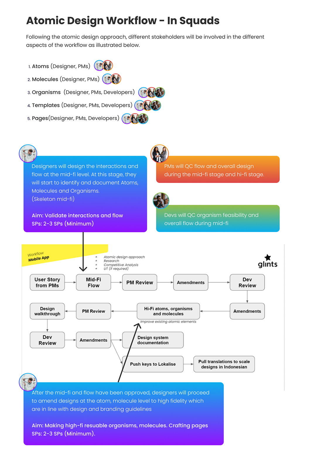
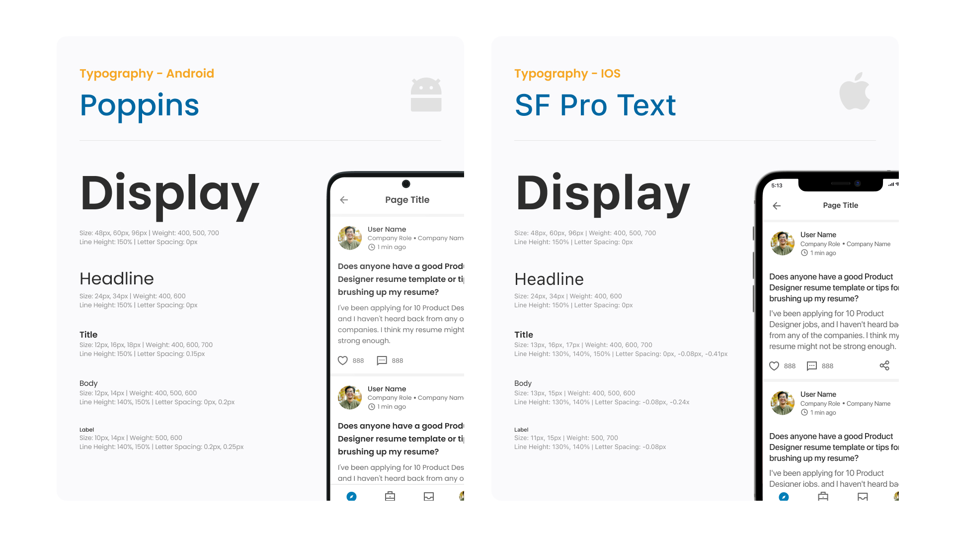
Created UI Kit and Design System based on atomic methodology
Developed content moderation strategies
Coordinated with branding for marketing efforts
Conducted user testing and research
Set up UX metrics tracking using the H.E.A.R.T. framework
Developed the company’s first app UI Kit using atomic design methodology
Sustained customer satisfaction (CSAT) above 80%
Achieved over 15,000 net installs in a single month
Achieved a 162% increase in monthly active users one year post-launch
To better understand the job seekers' journey, we conducted user research and interviews to uncover their types, needs, emotions, and pain points. These insights informed the development of initial features, shaped user personas, and guided our approach to achieving product-market fit.
With the research that we had done, we set out to establish what was needed for the first iteration of the mobile application. We were aligned that there’s a gap in the job market where users aspire to excel and grow but lack clear guidance.
Many rely on Google, YouTube, or friends for advice—some remain stuck, unemployed, and unfulfilled.
By providing access to actionable, career-advancing information, we empower users to unlock their full potential.
After the interviews, we developed user personas for the product, outlining user goals, needs, and frustrations.
This allowed us to understand the main jobs to be done by jobseekers and to understand what features were important to focus on.
This persona is motivated by long-term career stability and growth. Their decisions are driven by opportunities that enhance job security, skill development, and clear paths to advancement.
Designing for them means aligning with their need for reliability, clarity, and upward mobility.
.jpg)
A strong desire for professional growth and stability. They actively seek opportunities to build skills, earn promotions, and find clarity in their career path. Mentorship, structured learning, and visible progression ladders are key to supporting their goals and fostering long-term engagement.
.jpg)
Highly motivated by career security, skill growth, and upward mobility. She values mentorship, seeks recognition for her achievements, and strives for professional credibility.
Designing for her means creating experiences that offer structured learning, clear advancement paths, and opportunities to showcase expertise and impact.
.jpg)
Prioritizes career security and advancement, actively seeking skill-building opportunities that lead to promotions and recognition. They value platforms that help them grow professionally, demonstrate his impact, and gain visibility for their contributions.
Design should empower them with clear learning paths and ways to stand out in competitive environments.
.jpg)
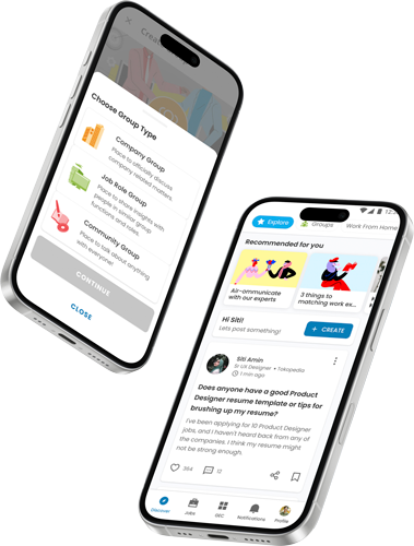
The sitemap of the first version of the mobile app, organizing MVP features like Sign In/Sign Up, Social Feed, and Job Applications for seamless navigation. This early planning ensured clarity, reduced ambiguity, and laid a strong foundation for design and development.
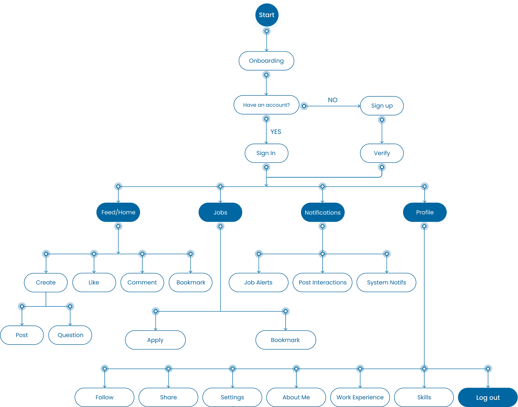
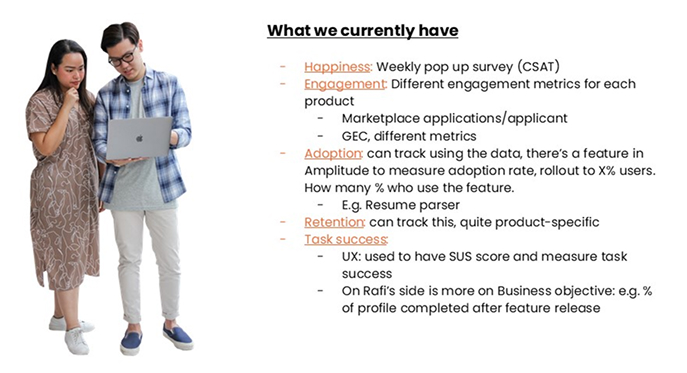
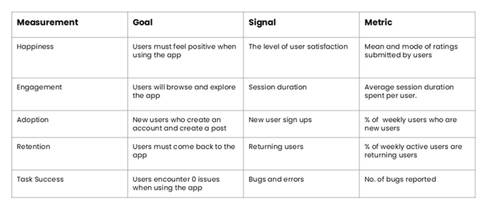
Before diving into design, it was essential to define success metrics, plan the sitemap, structure the information architecture, and address a major challenge: the absence of a design system and UI kit. Establishing and aligning on well-defined tracking metrics was also a critical step to ensure measurable outcomes. This was my proposal using the H.E.A.R.T framework.
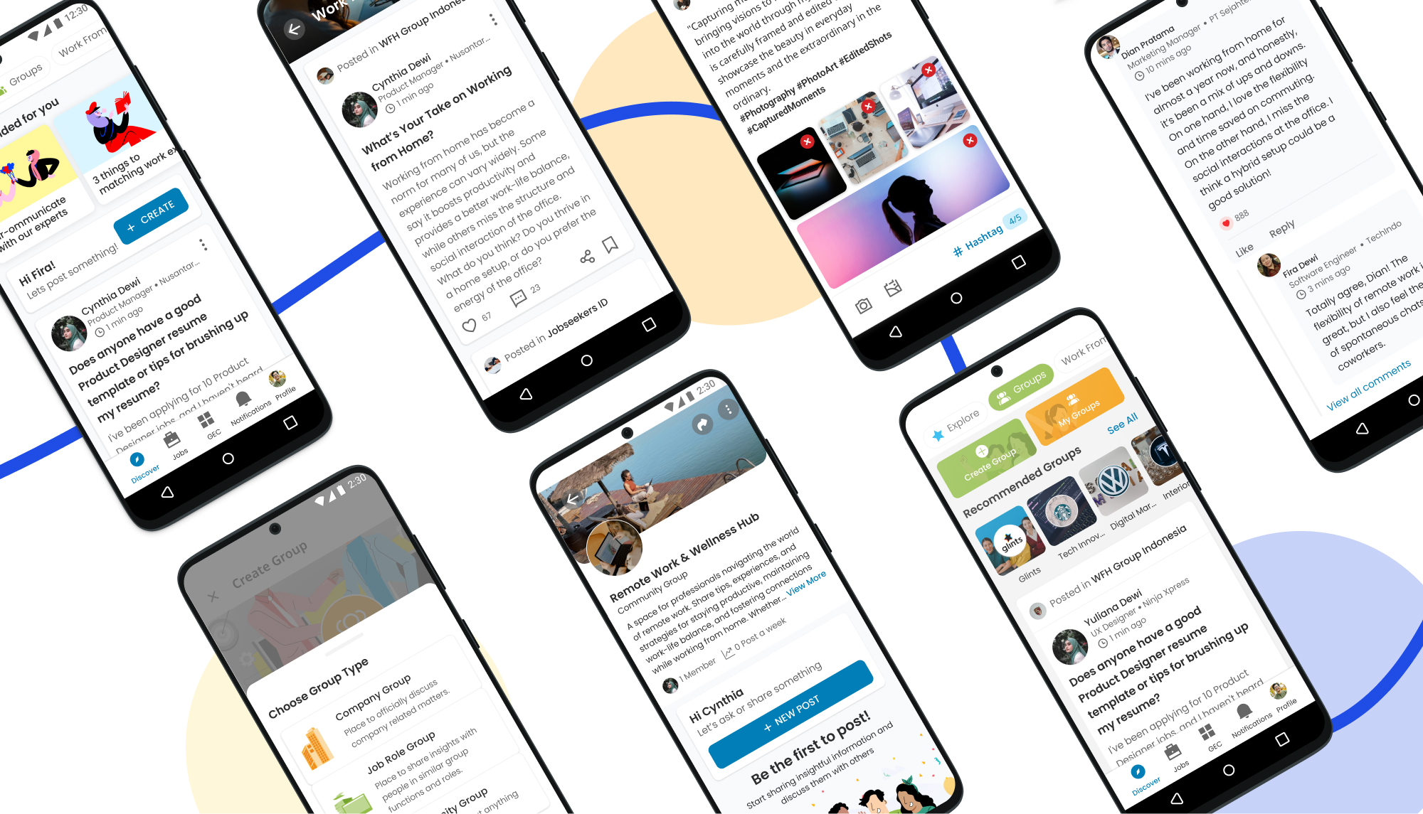
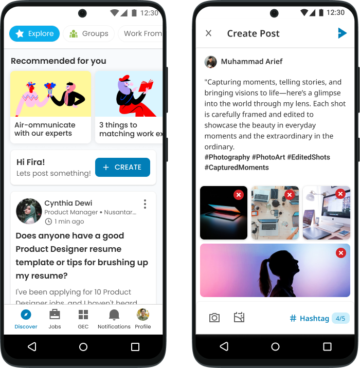
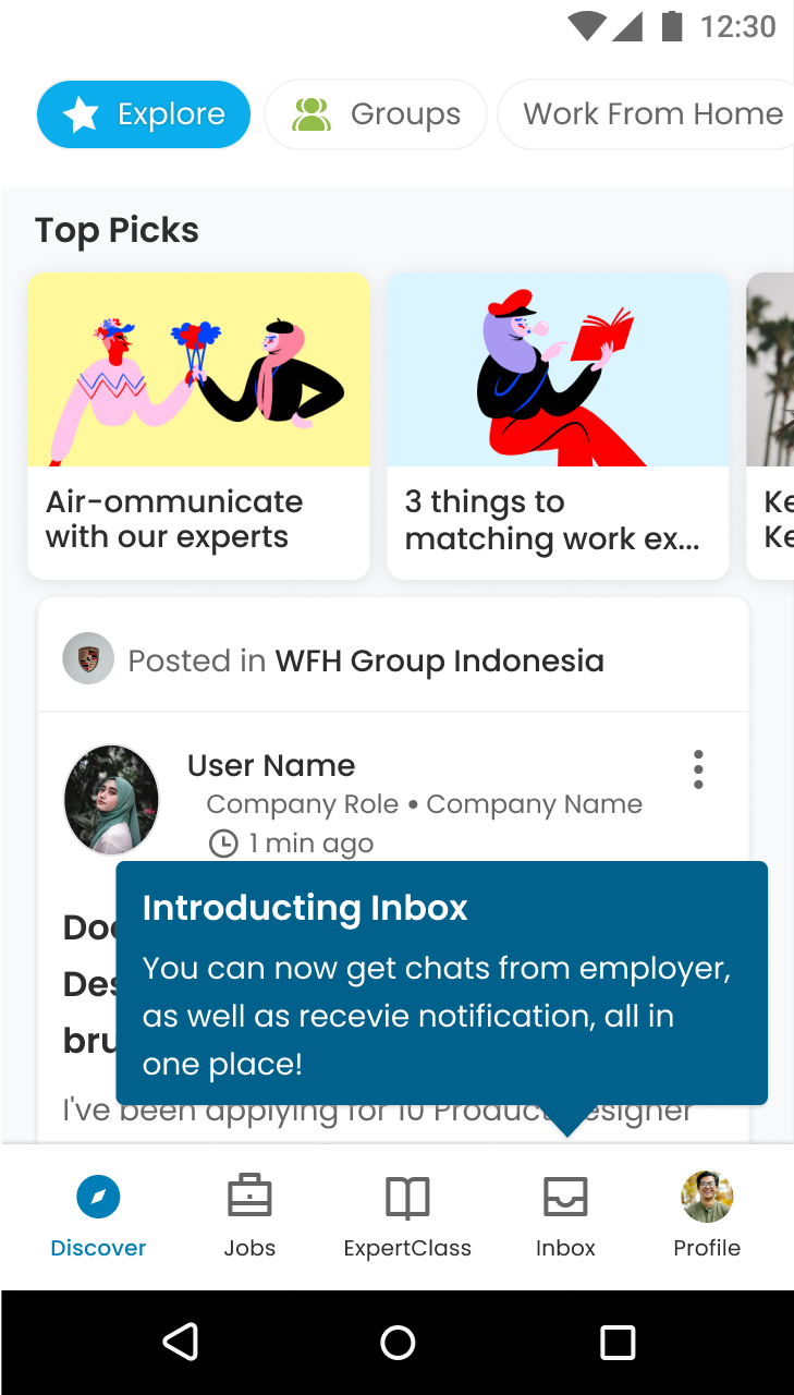
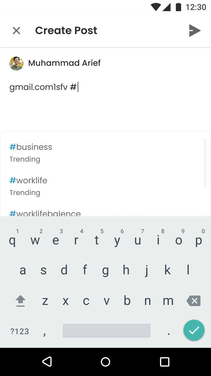
Users can easily add hashtags and media to their posts. Our backend algorithm then sorts and ranks these posts to display the most relevant content to users browsing the feed.
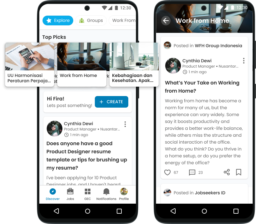
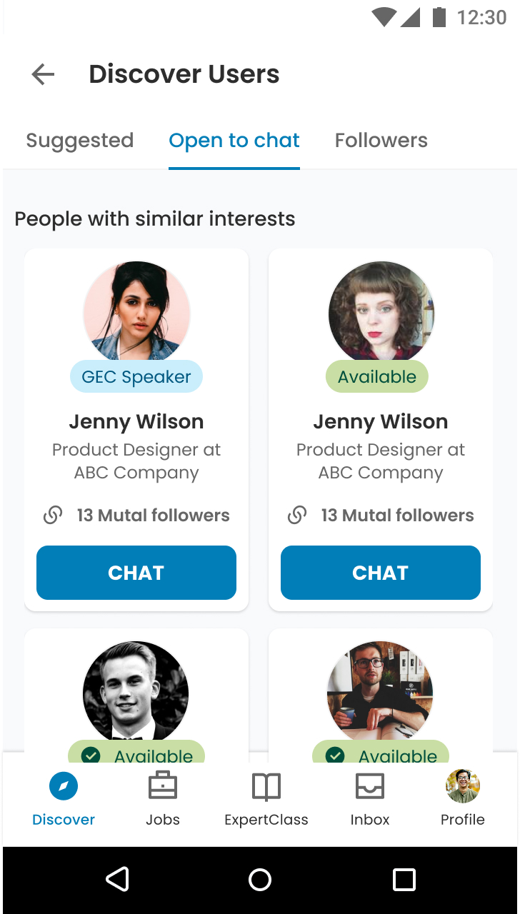
Groups were categorized to help users join the ones that best suited their interests. Similar to the feed, our algorithm sorted and recommended groups to users, encouraging participation and discussions.

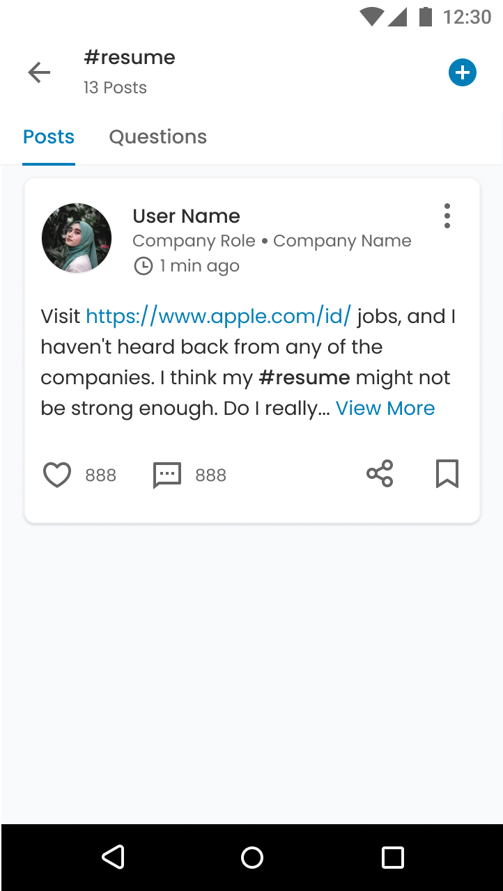
Posts were organized into topic pages based on hashtags and content, allowing users to explore and learn more about specific subjects. Each topic page displayed relevant posts, facilitating deeper engagement.
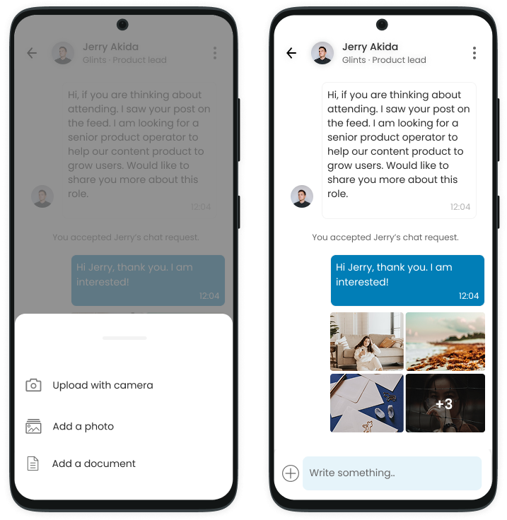
Chat feature, enabling users to communicate with each other and employers to engage with job applicants. This feature significantly boosted connection opportunities between employers and candidates
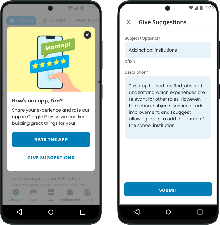
To boost our app store rating, we added a well-timed "Rate the App" prompt after key actions and included a feedback option to capture suggestions. This strategy raised our rating to 4 stars.
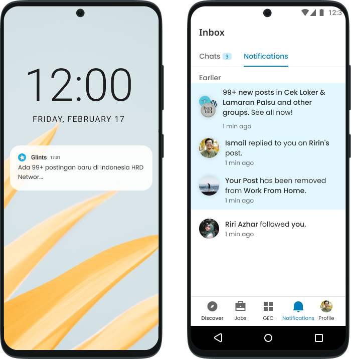
To boost engagement, we sent push notifications during peak hours—lunch and evenings—when users were most active. This strategy significantly increased click-through rates and in-app activity.
Despite a promising start, there was much more to accomplish. These initial features were just the beginning of our ambitious vision. With a growing backlog and an extensive list of future developments, rapid design iterations were essential for stakeholder alignment and engineering feasibility.
Fortunately, with an expanding and versatile UI Kit, iterations became more efficient through dynamic components and atomic design principles. I also worked on creating vision prototypes for upcoming features to ensure alignment and clarity for the team.
.jpg)
.jpg)
.jpg)
.jpg)
.jpg)
.jpg)
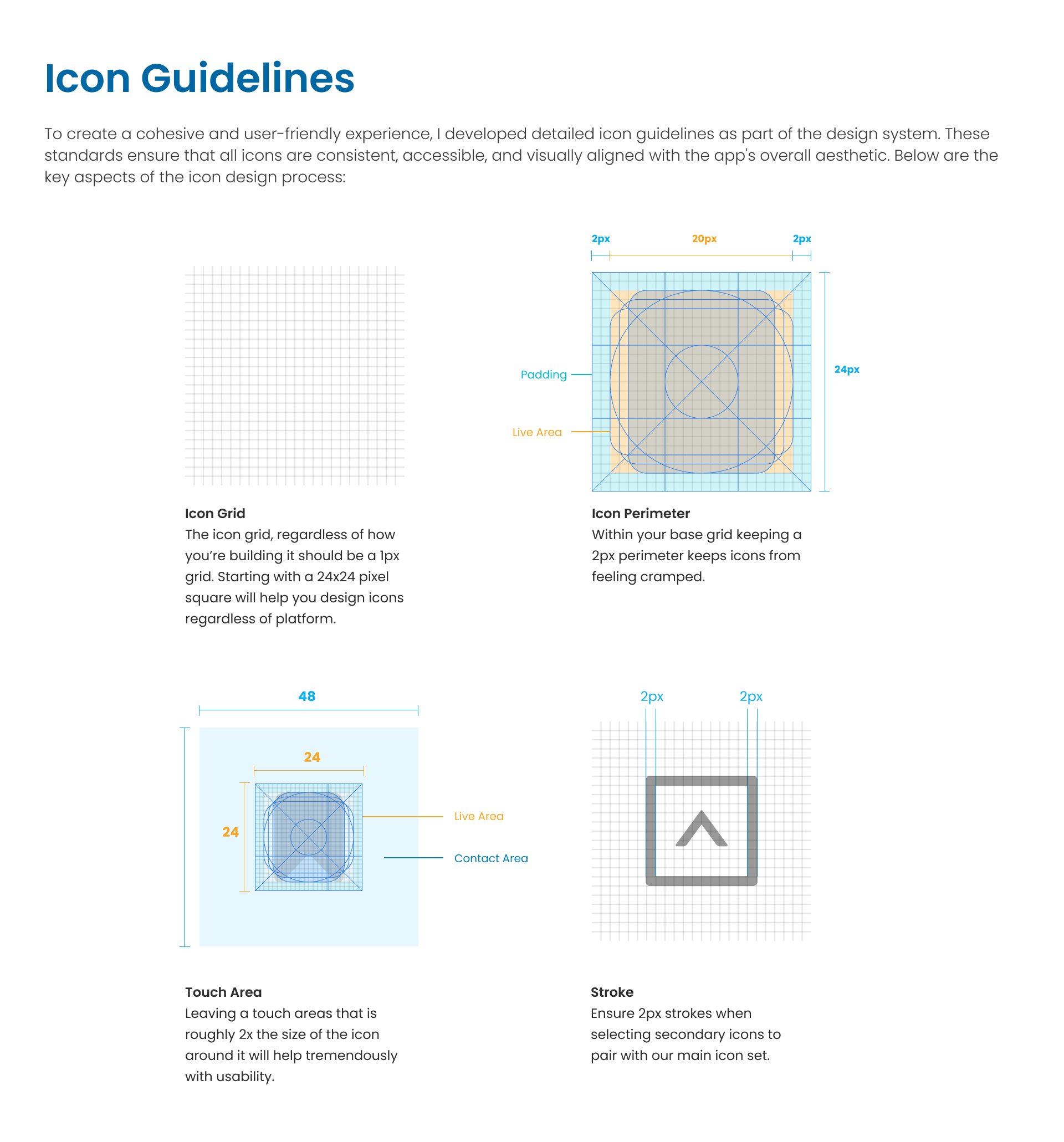
Embedded team into the atomic design process
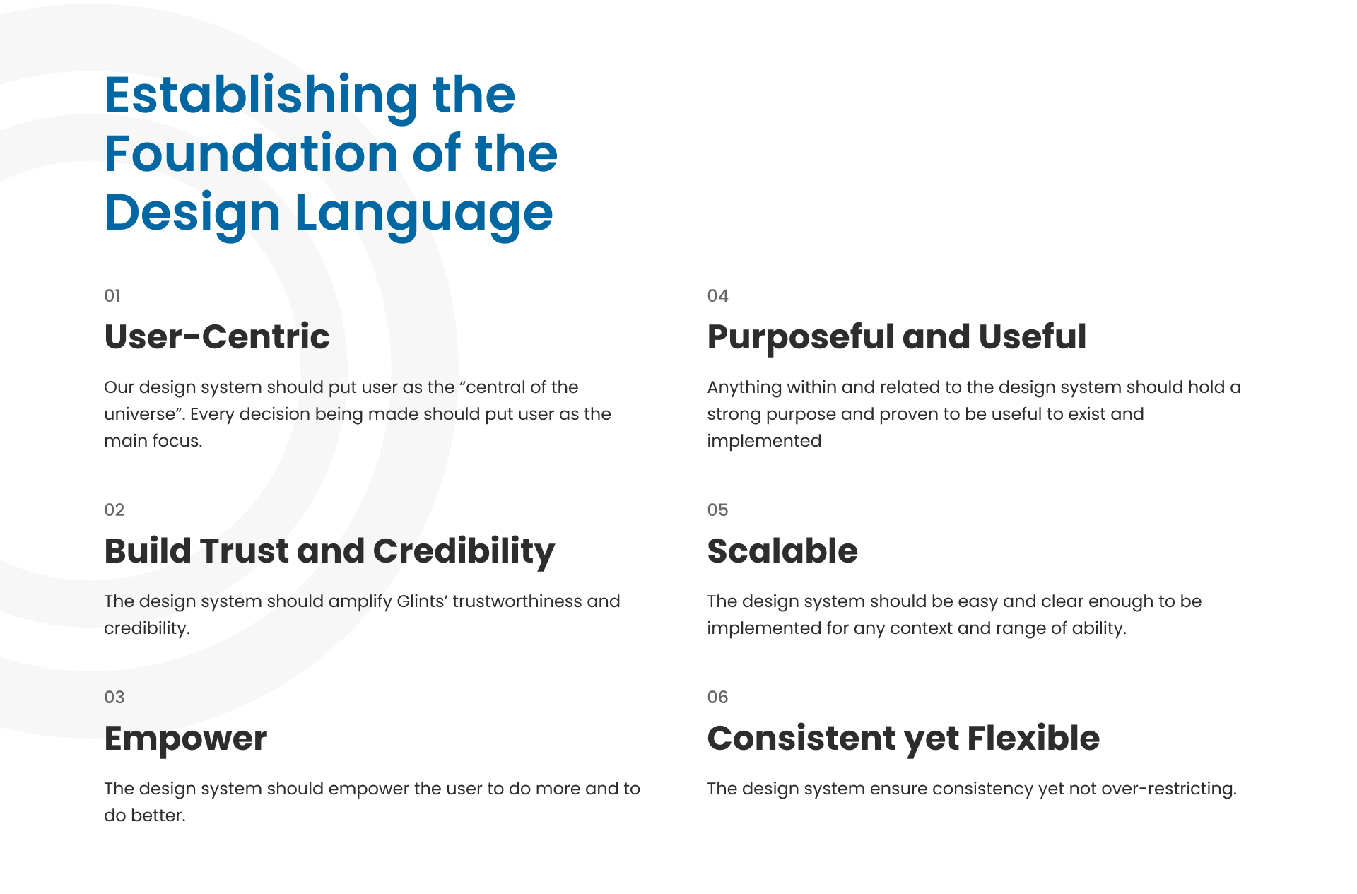
Defined design principles and visual language
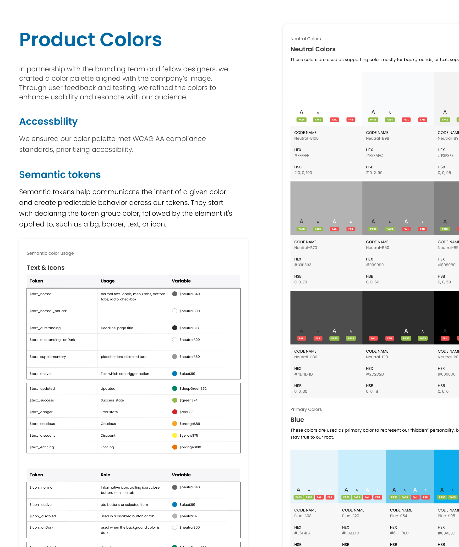
Established semantic color tokens
Designed and documented components
Created clear usage guidelines for consistency
.png)
At the start of the project, I took on the ambitious task of building the design system and UI Kit from scratch as the sole designer, investing significant time in creating specifications, variants, and atomic components. In hindsight, referencing an existing UI Kit could have accelerated the process and freed up more time for feature ideation.
Cross Function Collaboration: Ongoing collaboration with the content team helped the product team uncover new feature ideas and opportunities.
Cross-functional leadership: Balancing user needs, business goals, and technical feasibility was key.
Market Adaptation: Competitive research helped shape our product & UX strategy.
Scaling Design at Speed: A design system was essential for maintaining consistency while rapidly iterating.
Due to tight deadlines for the app’s first release, we initially overlooked content moderation—a critical feature for a content-heavy platform with a growing user base. As the social feed gained traction, it became a target for spam and malicious content. I detail how I addressed this in the case study.
The key lesson: while focused feature development is important, it’s equally crucial to take a holistic view of the app and anticipate foundational needs earlier.
.svg)